
How woven colors differ from digital artwork
Six yarn colors (red, blue, green, gold, white and black) are used to produce approximately 195 perceived color combinations. Colors are mapped to the closest available woven combination rather than reproduced exactly as screen colors. Bright neons and fluorescent tones cannot be reproduced directly.
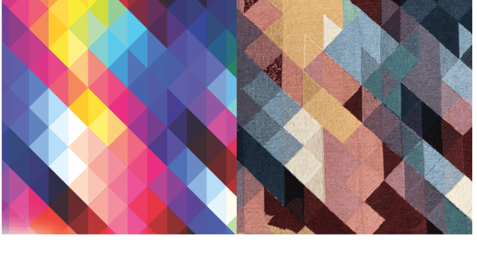
Yellows, light oranges and light greens can converge into the same gold tone. Dark blues, purples and dark reds can also become similar woven colors. Actual woven examples appear below.
Color swatch benchmark
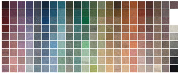
Use the Artwork Process color chart as a starting point when choosing flat graphic colors. Compare design colors to the supplier palette using an eyedropper; a screen-based color chart is a selection guide, not a guarantee of the physical yarn result.
Artwork versus actual woven result
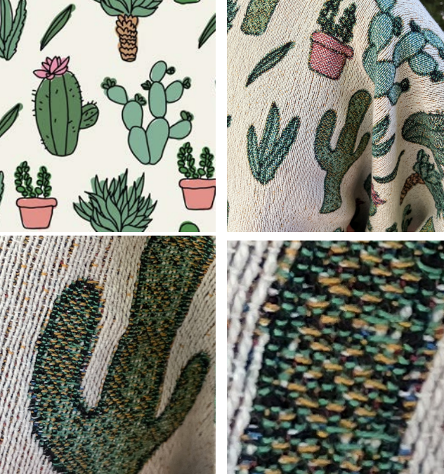
The cactus comparison shows edges and spines softening because woven detail is built from interlaced yarns. The geometric comparison shows multiple bright colors collapsing into fewer available tones.
Text, photos and fine details
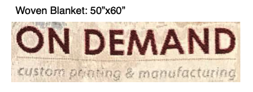
Choose clear, in-focus photos with contrasting subjects. Enlarge critical text and details, and avoid very thin linework or tiny lettering; woven throws use thicker yarn and a looser weave than tapestry accessories, so small details and edges may soften.
Accessories such as woven pillows, bags and wall hangings use a finer yarn and tighter weave, and may show greater detail. They can also differ in color from throws and apparel because their yarn construction includes polyester.
Merchant preview and approval checklist
- Start with the template at actual product dimensions. Keep the original submission artwork at its required template resolution.
- Check important text, small details, faces and color boundaries in a realistic woven simulation. Do not portray a digital mockup as an exact textile color match.