Engraving
👉Design Do's and Don'ts
Refer to the info below for a quick visual guide to optimal design practices:
Refer to the info below for a quick visual guide to optimal design practices:
DO ✅
- High contrast images: Use bold, high-contrast graphics. Sharp outlines and filled black
areas yield the best clarity - Sufficient line thickness (> 0.01 in wide), clear text
- Black and white artwork only
- If using text make sure it is 100% Black
-3.png?width=425&height=425&name=image%20(2)-3.png)
AVOID ❌❗
- Grayscale images, Gradients/Shadows: Glass does not render shading or tonal transitions effectively
- Thin text lines (character font below 6pt)
- Small or intricate text
-2.png?width=425&height=425&name=image%20(3)-2.png)
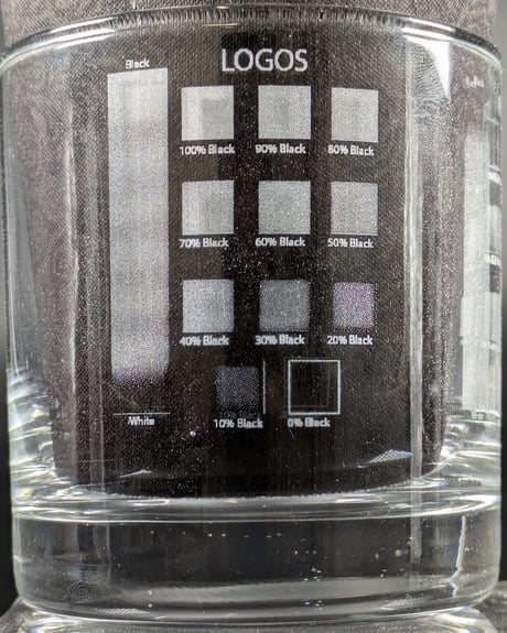
For Designed Artwork (Logos, text, animation, etc), you will want to have the images be as close to 100% black as possible to get the best engraving result. Logos or text can still be sent at lower black percentages however the engraving may not be as crisp.
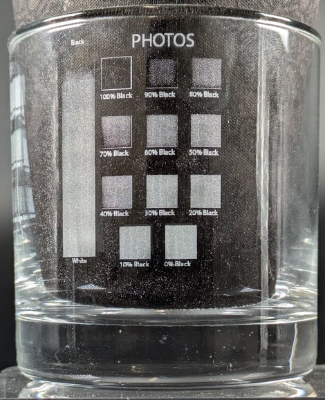
For Photos, we take the file and inverse it so that the highlights get engraved and the lowlights do not get engraved. Wherever the photo is white, the machine will engrave at 100% power and wherever there is black the machine will not engrave.
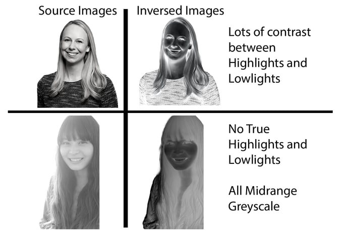
Below is an example of and images that would be good engravings vs poor engravings. The top photo has lots of contrast between the highlights and lowlights which results in a clear crisp image. The bottom photo looks faded and when the file is inversed there are no sections that are close to 100% black or 100% white. This will result in an image that looks faded or not as clear.
Printing
DO ✅
- Use images of sufficient quality and resolution. We suggest no smaller than 300 dpi
- Use solid colors whenever possible
- Use simple and bold text

AVOID ❌❗
- Low resolution images
- Gradients/Shadows designs
- Over decorative and thin text
